A Minor Feature,
A Memorable Touch
Design That Extends a Friendly Hand to Users
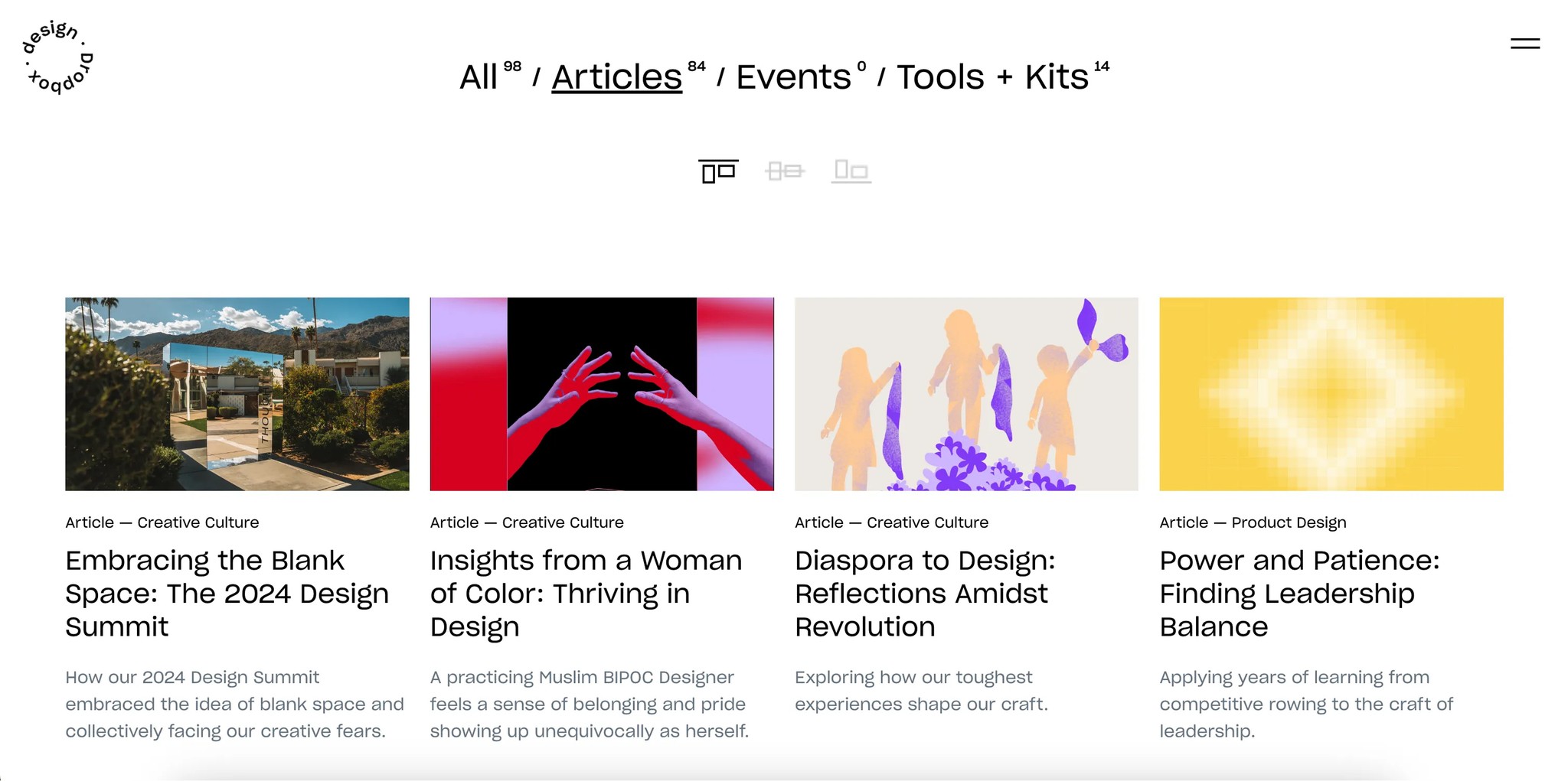
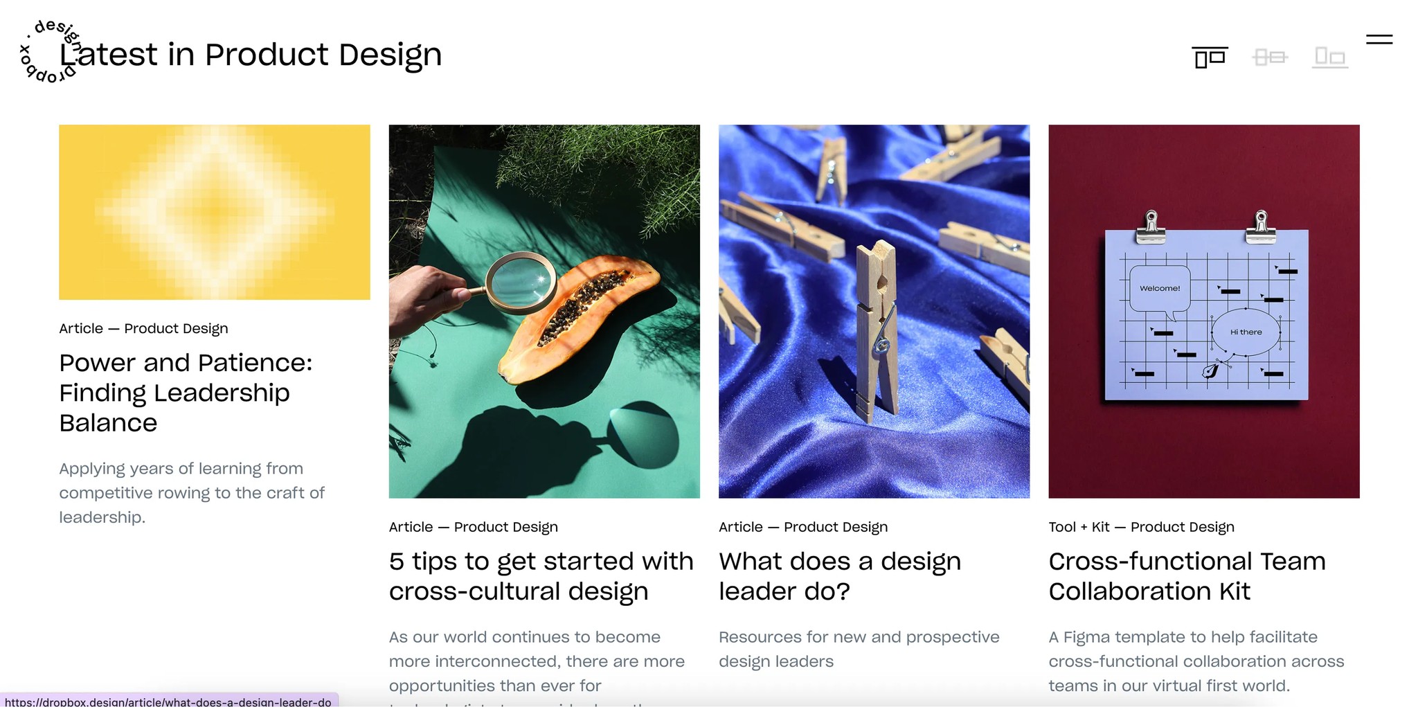
The Dropbox design site gives users the ability to adjust the layout. You can choose how you want to view the listed articles — top-aligned, center-aligned, or bottom-aligned. And this option is conveniently placed right at the top, in a spot that’s easy to notice.
At first glance, it seems like a small thing. But every time I see it, I find myself wondering — why? The articles are already neatly arranged, so it’s not like there’s any real difficulty in browsing them, right?
User perspective:
It allows for a personalized experience. I can view the content in the way that works best for me.
Dropbox Design Team’s perspective:
I imagine that when designing the article thumbnails, the team gained more creative freedom. Perhaps this was the starting point for that. Now, both horizontal and vertical image formats are possible. (In fact, at a company I worked at before, the site wasn’t very flexible, and thumbnails could only be inserted horizontally, which frustrated the marketers.)
Our general observation
Typically, when handling a lot of information at once, we use filtering features to sort and view what we need. But here, there’s a sense of spaciousness. The depth isn’t too complex, and since there isn’t an overwhelming amount of information, the simple menu is sufficient for categorization. There’s no real need for a filter feature.
It might seem insignificant, but to me, this feels like a subtle kind of sense. These little details can make a site more intriguing and memorable for users.
It’s almost like saying, “We have all of this to show you, but how would you like to see it?”
The two approaches — the freedom of showing everything versus letting users choose how they see it — are not the same, are they?