
Is Your Onboarding Screen Really Designed for the User?
In the app development process, onboarding screens are considered essential. However, they are often not seen as a key part of the user experience. Because of this, many services overlook the importance of carefully designing their onboarding flow.
Recently, while analyzing the Flowkey app, I discovered a small but effective idea for onboarding design.
Flowkey’s Onboarding Experience Falls into Two Categories:
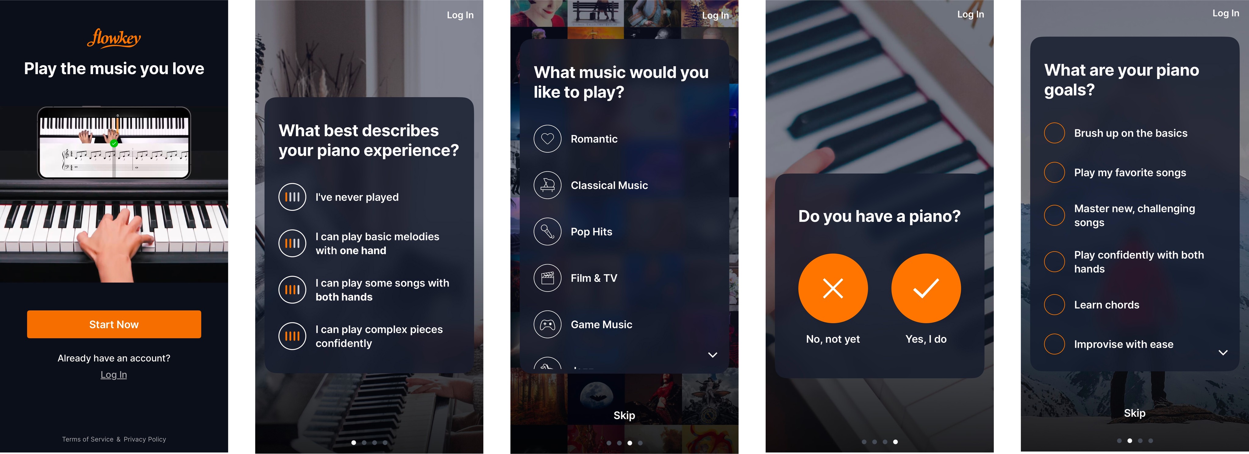
User Data Input: Personalizing the experience based on user preferences
Onboarding Guide Video: Helping users quickly understand the core functions
I was particularly impressed by the onboarding guide video.
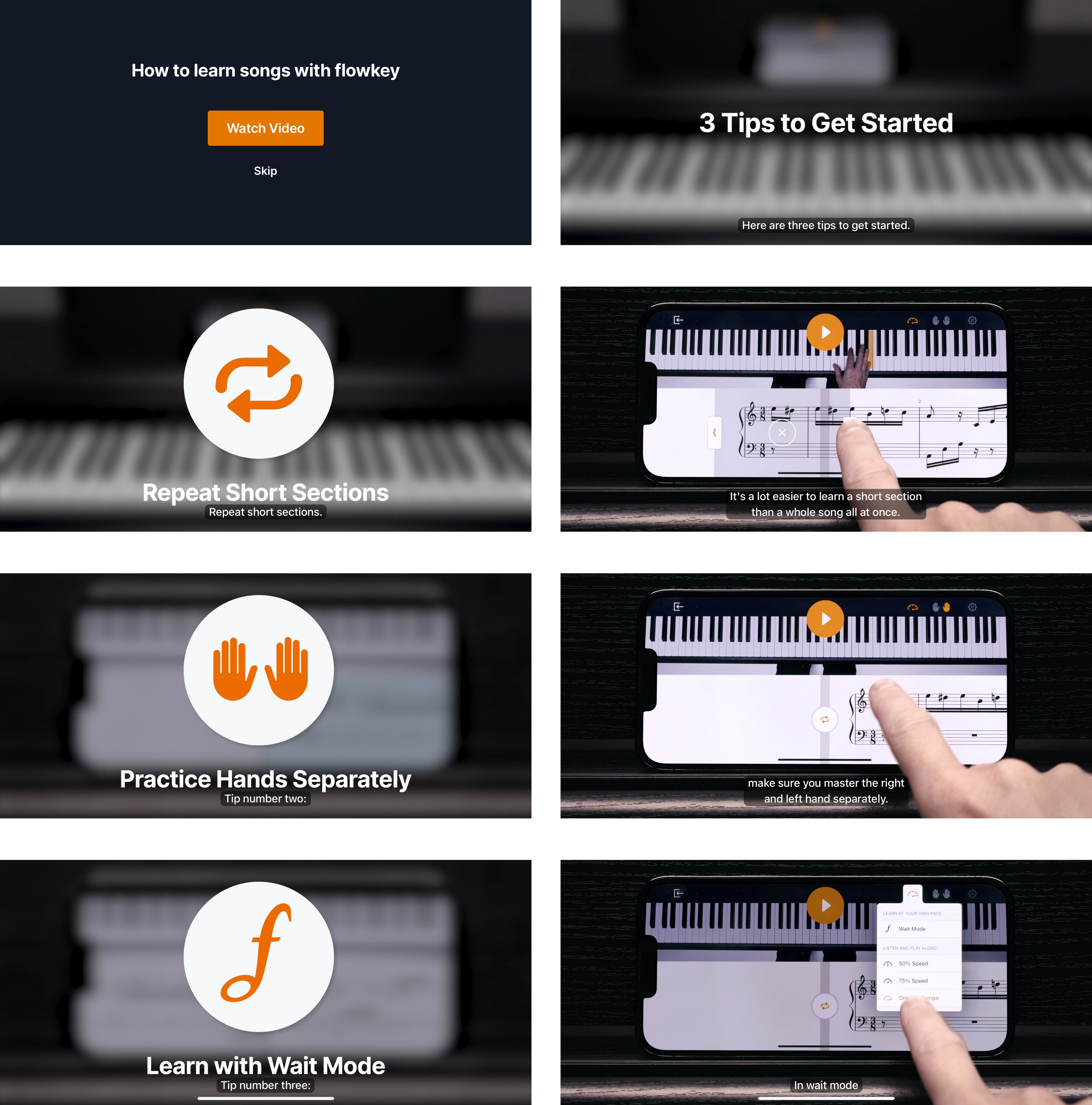
A 1-Minute Video That Makes Features Instantly Understandable
The video combines audio and subtitles, allowing users to grasp how the app works without the need for complex UI elements or lengthy explanations.
Users Can Watch It Anytime They Need
The video is easily accessible whenever users want to revisit it, rather than being forced upon them every time they open the app.
(In contrast, some services require users to go through coach marks every time they return, which can be frustrating.)
Key Takeaway:
💡 An onboarding experience can only be simple if the app itself is simple.
Flowkey’s onboarding doesn’t rely on traditional coach marks or sliding screens. Instead, it takes a more user-friendly approach by using a short guide video that helps users understand the core functions effortlessly.
These small yet thoughtful design choices can be a major trigger for increasing user engagement and retention.